Salomon Serna
Perron — Urban Hot Dog Brand Identity
Where street food meets bold identity.
December 2025
Perron was born from the desire to create a street-food brand with personality. Inspired by bold urban energy and customizable flavor culture, the project aimed to transform a simple hot dog concept into a brand with attitude, presence, and visual impact. The vision was clear: build something vibrant, loud, and scalable, capable of standing out on the street and growing into a strong commercial identity.
SERVICES
Creative Director & Brand Designer

Project Overview
• Create a bold and memorable street-food brand with strong personality. • Develop a flexible visual identity system adaptable to packaging, menus, and digital presence. • Position Perron as a distinctive and competitive brand within the urban fast-food market. • Build a scalable foundation for future expansion and brand growth.
Perron is a bold urban street-food brand designed to combine strong personality, high visual impact, and scalable commercial growth.
Perron was conceived as an urban street-food concept designed to break away from traditional fast-food branding. The project emerged from the opportunity to create a hot dog brand with strong personality, bold visuals, and a clear attitude that could resonate with a younger, dynamic audience. In a saturated market dominated by generic visuals and repetitive concepts, the challenge was to build a brand that felt energetic, recognizable, and scalable. Perron was developed not only as a food offering, but as a visual and cultural statement capable of expanding across different formats and touchpoints.
Approach

Fashion shooting in the studio
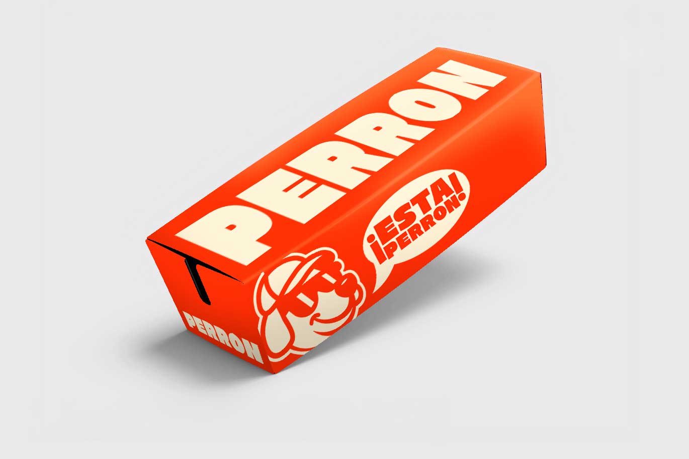
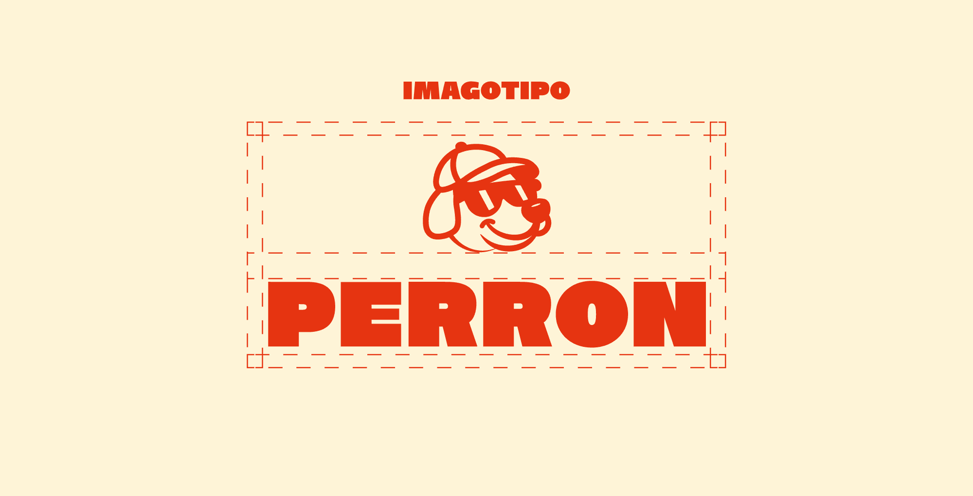
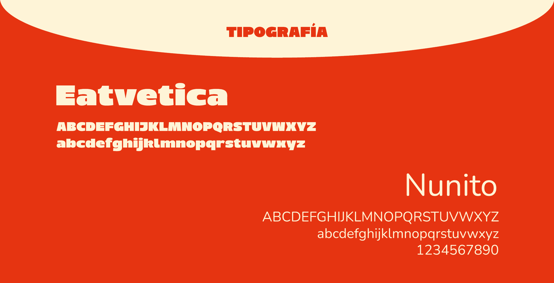
The project began with defining a strong and differentiated brand personality rooted in urban culture and bold attitude. The focus was to establish a clear positioning strategy that would allow Perron to stand out in a saturated fast-food market while remaining scalable and adaptable. From there, a flexible visual identity system was developed, built around strong typography, high-contrast color combinations, and dynamic graphic elements. The identity was designed to perform consistently across packaging, menus, and promotional materials, ensuring immediate recognition and long-term growth potential.
Strategic positioning and dynamic visual design were integrated to build a scalable urban brand with strong personality and market differentiation.
Process
From strategy to execution, the process focused on building a bold, scalable, and visually impactful urban brand.
I start by clarifying the brand’s personality and market position, develop a dynamic identity system, and translate it into cohesive and impactful brand experiences.

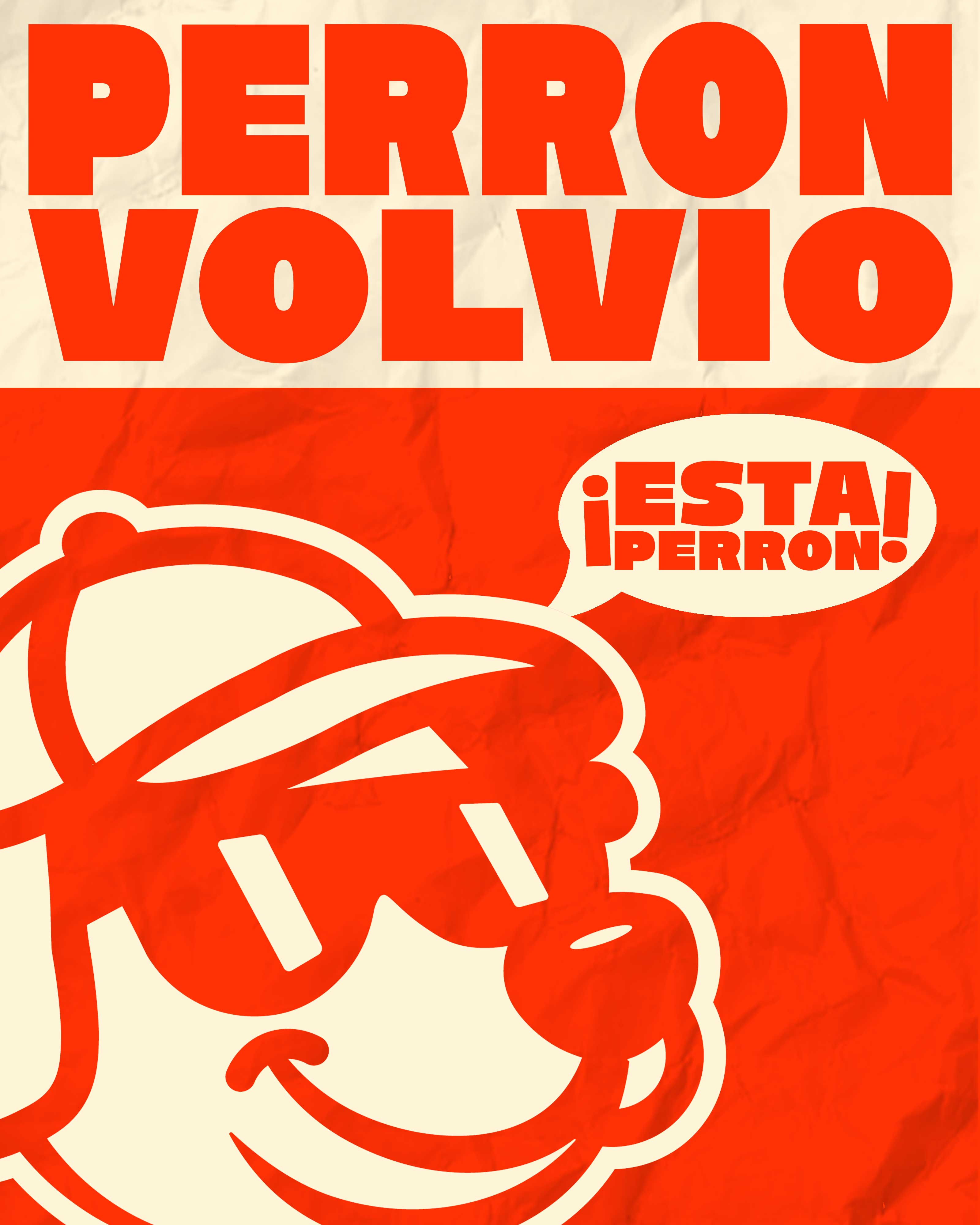
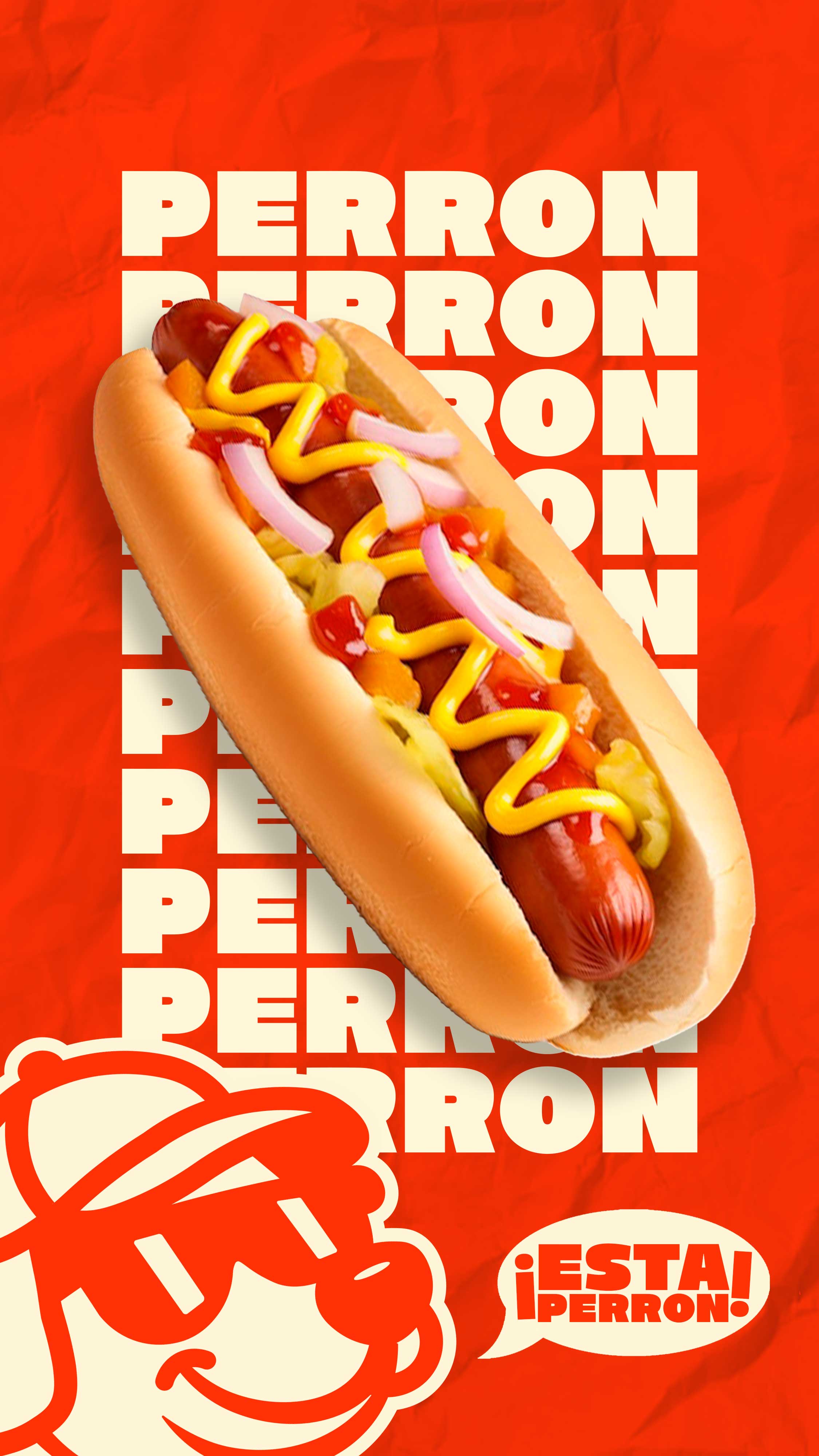
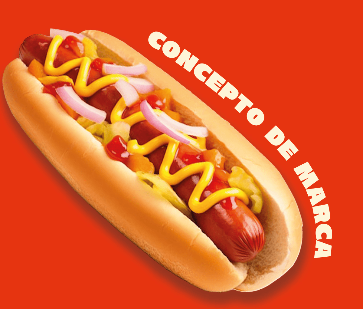
The philosophy centered on transforming street food into a visual statement. Perron was designed as an expression of attitude and flavor, where bold color, strong type, and energetic composition reflect the brand’s unapologetic identity and urban roots.
Final Design
The final design establishes Perron as a bold and recognizable urban brand, combining strong visual language with strategic structure to achieve differentiation, consistency, and scalable growth.
The final design positions Perron as a bold, high-impact urban brand, combining strong visual language with strategic structure to ensure differentiation, scalability, and lasting market presence.
Product Images